Trackernet Stringlines: real-time graphical service analysis for the London Underground
Update: I presented on this project at TransportationCamp New England 2025. Slides here.

I’ve long had a great affinity for the London Underground. It’s one of the world’s oldest and largest rapid transit networks, and it speaks to me in a way which few others do. Nearly 20 years ago, while reading District Dave’s London Underground Site, I came across this video (at the time posted on the now-defunct Google Video), and something just clicked. The Tube, from that point on, was important to me.
So, I’ve long wanted to build something useful with London Underground data, because that’s what transit nerds who are also software developers do. A prior effort didn’t go so well, but recently, with urging from some friends, I overcame inertia and ennui and built a real-time stringline tool for the London Underground, using data from the Trackernet API. The stringline diagram is a classic tool in transportation planning and service management which has been around since the mid-1800s—a line graph with time on one axis and the stops along a line on the other, where each line represents one trip from origin to destination.
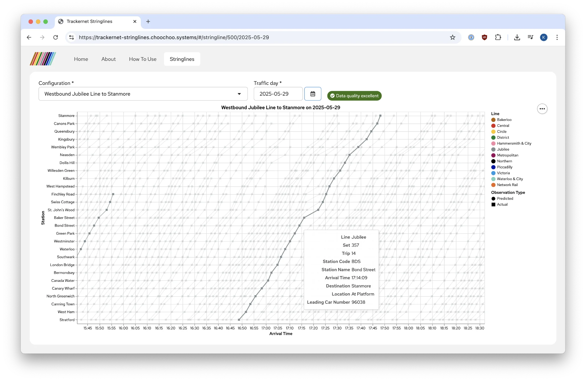
There are actually a few parts here—first, an archiver which queries the Trackernet API and logs the responses in a ClickHouse database, then, a set of ClickHouse materialized views to unpack the arrival data, and finally a JavaScript frontend to visualize the data.
While I’m thrilled with the end result, the journey hasn’t been without some disruptions. The Trackernet API has a few quirks, and I have spent the past few months learning to work around these and get the best possible data out. I am well aware that TfL have been trying to nudge developers towards their Unified API for nearly a decade now, but I must state unequivocally that it would not have been practical to build this tool using data from the Unified API. As developers have been pleading on the TfL Tech Forum for years, the Unified API is simply not equivalent to the legacy Trackernet API for some use cases (including this one).
So, when I point out shortcomings in the data, it is strictly not through the lens of “oh, this is awful, scrap it”. I don’t deny that the Unified API must be enormously beneficial for folks who just want to build a quick arrivals widget. But for more intensive analytical applications, being able to obtain data as close to the source system as possible, with all of its complexity and nuance, is essential. To put it more bluntly: the very smoothing-out of complexity that the Unified API performs, while beneficial for simple use cases, also greatly limits its utility for intensive analytical applications. And while it may be tempting to say “well, most folks just want to know when the next train is coming, don’t they?”, open data initiatives should not discriminate among forms of use or intentions. Intensive data analysis is just as valid as a “where’s my train” widget.
With all of that said, a few notes on some of the more interesting quirks:
PredictionDetailedendpoint does not return for some stations: There are some line-and-station pairs which appear in thePredictionSummaryendpoint that, when fed to thePredictionDetailedendpoint, lead to it timing out. It doesn’t return an error immediately; it just…times out. This isn’t entirely catastrophic, since most fields are also present in thePredictionSummaryresponse, but it is somewhat limiting.- Intermingling of lines: While it might appear that querying the
PredictionDetailedendpoint for, say, the Metropolitan and Hammersmith & City1 Lines at Moorgate should produce different sets of results, it does not. Because set numbers do not overlap among lines on the Sub-Surface Railway (and the relevant ranges are published in the Working Timetables), it is possible to use these to filter arrivals by line, but this is nonetheless counter-intuitive behavior. (The exception appears to be atBAYandNHG, which return no arrivals when queried on the District Line but do return arrivals (including District Line trips) through the H&C endpoint!) - Sub-surface Railway data quality: Within CBTC territory, data quality on the Sub-Surface Railway is quite good. However, particularly beyond Wembley Park, most trips lose their trip number (or rather, their arrivals have a trip number of
0, which makes it impossible to distinguish sequential trips by the same set). Among the trips that do keep their trip number, though, some actually retain their trip number after beginning a new trip at a terminal, and do not pick up the correct (next) trip number until a few stops into the next trip. Of course, being able to unambiguously group stops into trips from terminal to terminal is an essential function for being able to plot stringline diagrams meaningfully.
Having been on both sides of the fence—both as an open data user and also having worked on the systems which produce such data within an agency—I understand that there is a natural temptation to bristle when open data deficiencies are pointed out. But I’ve also learned that oftentimes improving the quality of open data in turn leads to better, higher-quality internal data and internal analytical and operational tools as well.
In any event, I’ve had great fun building this tool, and I hope it is useful to someone—perhaps to actually analyze service on the London Underground (!), or, if nothing else, as a technology demonstration.
-
Note that the Circle Line is timetabled as part of the Hammersmith & City Line, just as Z trains are part of the J timetable and W trains are part of the N timetable on the Subway. ↩