Visualizing transit service levels using GTFS data
The May meeting of WMATA's Riders' Advisory Council featured a presentation on proposed cuts to weekend Metrorail service, which would involve lengthening headways on most lines. One RAC member noted that some headways will be quite long if these cuts are put into place, and asked how Metrorail service levels compared to other transit properties. It seemed to me that this was the sort of task that would probably be assigned to an intern to brute-force the problem by looking up schedules for other transit agencies and manually determining the service levels, but I knew there had to be a better way. I figured this might be the sort of information APTA would have available, but I quickly realized that there was an even better approach: use publicly available GTFS feeds to plot service levels and span-of-service. Over the weekend, I whipped up a Python script which uses Google's transitfeed library and matplotlib to generate histogram-like plots showing service levels at a particular station. For reference, here's an example from the Lexington Avenue Line in New York City:

Click on the image for a larger version, or here for a full-resolution PDF.
Note that there are two bars for every hour; the one on the left shows service for 'direction 0', while the one on the right shows service for 'direction 1'. The GTFS specification uses '0' and '1' for directions, rather than cardinal directions or destination names. To help map these to meaningful directions, the plot includes a key listing all of the headsigns for each direction. From that key, we can determine here that direction 0 is northbound, while direction 1 is southbound.
The software required only minimal modification to work with feeds from other transit agencies; here are two plots generated using data from the CTA and WMATA:
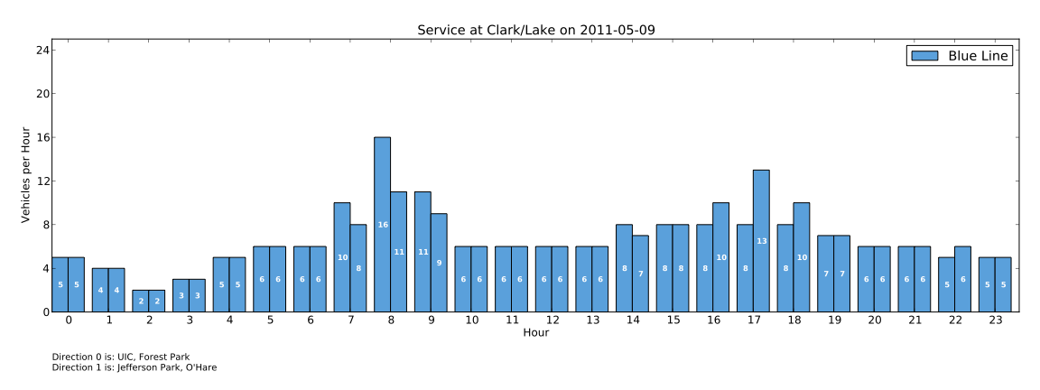
Click on the image for a larger version, or here for a full-resolution PDF.

Click on the image for a larger version, or here for a full-resolution PDF.
While I am a great fan of Edward Tufte, I do not claim to be an expert in data visualization, and the presentation could probably be improved. That said, I think it rather clearly illustrates service levels as well as span-of-service (note the empty space in the early morning hours on the Metrorail example). Because service in each direction is shown separately, it also works for peak-direction-only services (like the 6X in the Lexington Avenue example). Also, because multiple routes can be shown on one plot, the tool ideally illustrates combined service frequencies as found on many systems. Service on any one of those routes can be shown individually simply by changing the configuration file and re-running the tool. While I haven't tried it yet, the tool should work for bus routes just as well as for rail.
These plots are useful not just for determining overall levels of service, but also how the service is operated. For example, look at this plot for the Flushing Line in New York City:

Click on the image for a larger version, or here for a full-resolution PDF.
Note that when the 7X peak-hour peak-direction express service operates, the total number of trains in service across both directions remains fairly flat—the 7X trains return in the off-peak direction as 7 local trains. In addition, the plot shows that the span-of-service for the 7X express service is much greater in the evening than in the morning.
If you're interested in the technical details behind this tool, I've posted another blog entry with some additional information; you may also be interested in the source code.
Update: Now for PATH, too!